Every CEO knows the importance of creating a strong brand. Not only does it tell your customers what they can expect from your company, but it also engages your employees and builds corporate and financial value.
Josh White, Principal and Creative Director of NYC-based brand and design agency OffWhite Co., explores how three brands turned themselves into household names.
With studies showing 94 percent of people will recommend a brand when it establishes a positive emotional connection and almost 60 percent of consumers are willing to try a new line when they recognize it as a brand they trust, how do you ensure you nail your branding strategy?
In my role helping companies in all sectors — from major brands to start-ups — to successfully launch new products or refresh tired ones, I have seen firsthand the make-or-break difference a cohesive brand strategy can deliver. Doing it right means telling a compelling story that goes beyond what you’re selling to relay an honest message that resonates with all your stakeholders.
Take the examples of Uber, Dunkin’ and Chobani, all of which recently refreshed their brands with outstanding results. Each focused on three areas I consider to be key to elevate any brand: simplification, clarity of message and building trust.
Uber – Moving People to Where They Want to Be

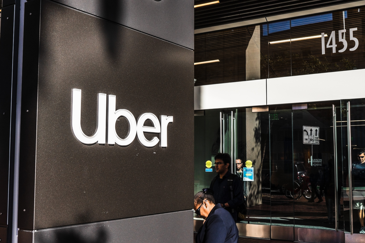
When Uber disrupted the ride-hailing business in 2009, it was so radically different, it needed a premium brand that riders could trust, and the initial boxed ‘U’ logo accomplished that. Fast-forward to today and the company’s branding is taking a bold new lifestyle angle that is more approachable and invites people to dream big.
The refreshed brand architecture is simpler and consistently sends a message that this is a company moving people beyond a journey from point A to B – it is driving people to reach their goals. Trust is expressed in authentic photography of everyday heroes, shot in real-life context as opposed to in studio. Not only is Uber connecting emotionally with users of its platform, but it’s also appealing to potential drivers who will join the company because they relate to it.
Dunkin’ – A New Look for People On-the-Go
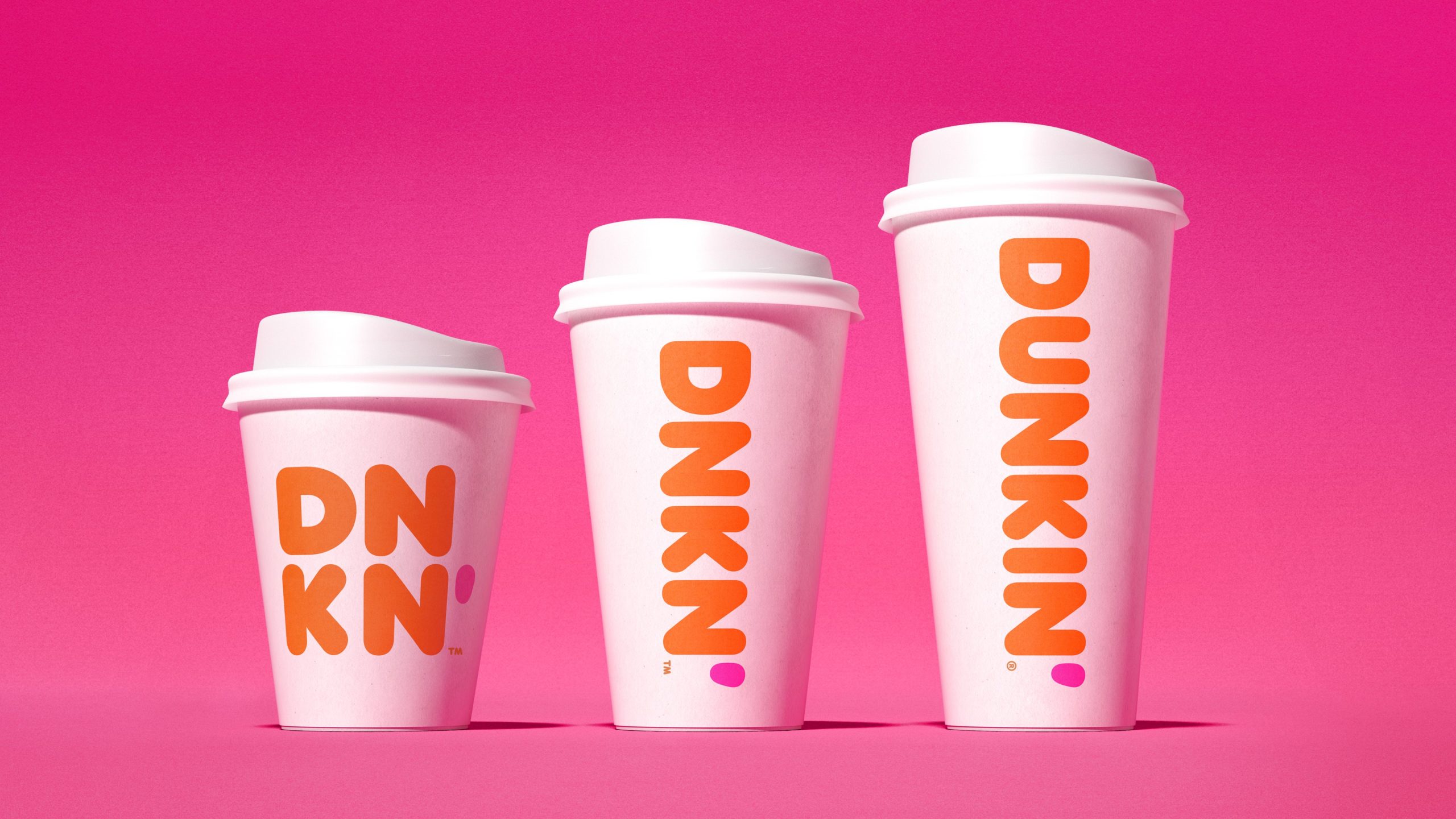
When the iconic Dunkin’ Donuts shortened to Dunkin’ last year – and in some instances, simply DNKN’ – it found a brilliant way to share its modern brand story while paying homage to its rich heritage. The company is now using its cleaner brand to tell a broader story in a more dynamic way that connects with today’s consumers. While clearly expressing that it offers more than donuts, consumers recognize the iconic lettering and ’70s orange and pink coloring as assurance they can expect the same delicious products.
As it transitions to be a “premiere, beverage-led, on-the-go brand,” Dunkin’ is introducing next-generation design concepts that are social-ready. It has successfully simplified an iconic brand and sharpened its message to emphasize that it serves great coffee fast, while maintaining the trust of a loyal consumer base.
[ymal]
Chobani – Paying Homage to a Simpler Time
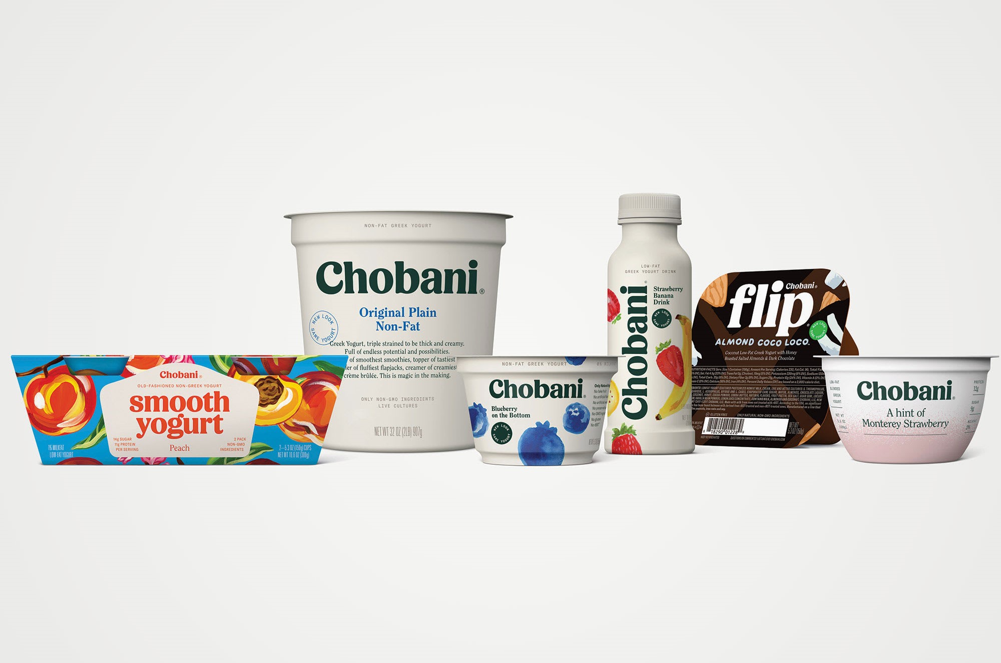
When it launched in 2007, Chobani was on a mission to be the number-one-selling Greek yogurt in the U.S. It’s strong, stylized brand at the time, supported by head-of-its time beautiful packaging, elevated the yogurt category and was grounded in delivering a premium consumer experience.
Now the company is heading in a new direction with an expanded palette and more product offerings in the pipeline. The words “Greek Yogurt” have been dropped from the main brand architecture and yet the updated logomark alludes to the creaminess of yogurt to reassure consumers the product is the same one they already trust. Simplified illustrations on packaging, stylised photography and folk art style in communications take consumers back to a simpler and more carefree time that aligns with the company’s strategy to allow for an expanded runway into plant-based and other expanded product offerings. The simpler serif-style, almost chunky logomark in deep green color is in step with the company’s “Sprouting Seeds” initiative and sends the clear message that Chobani is doing good, for your health and for the environment.
All three brands are heading in a clear direction, using a proven formula to ensure their brand positioning and assets are in line. The result? A much deeper and richer expression of who they are, why they exist and where they’re headed that ultimately adds to the bottom line.


